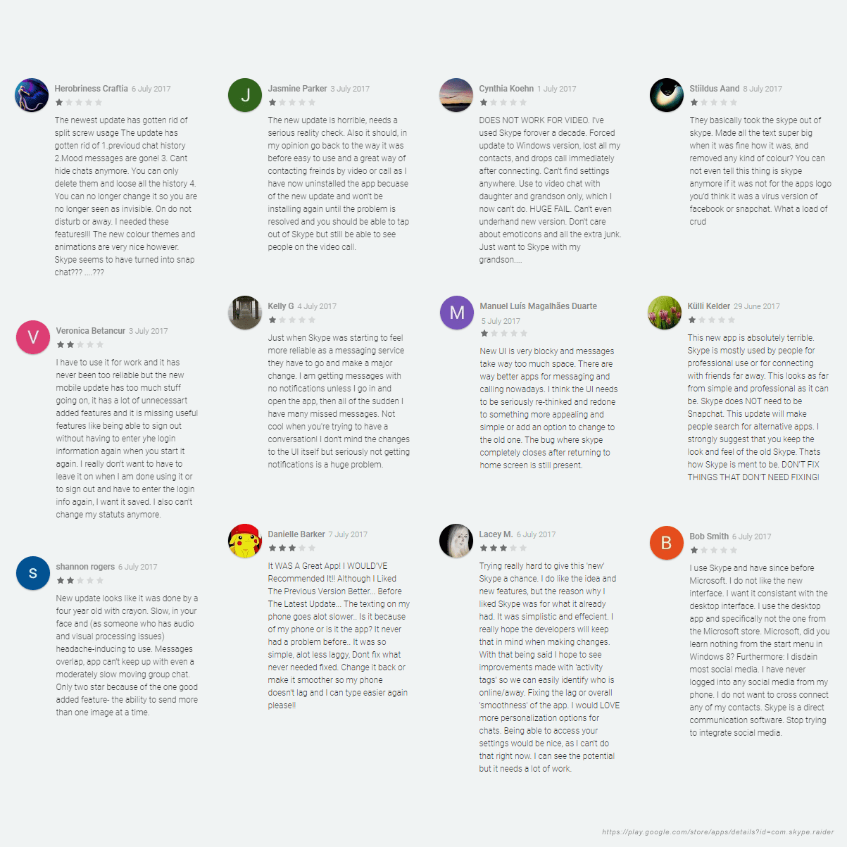
Skype mobile app was updated in July 2017 and immediately started collecting users’ complains about new design. I’ll try to improve some critical moments that disturb users:
- The navigation is not intuitive
- Text is too big
- Skype lost its brand look
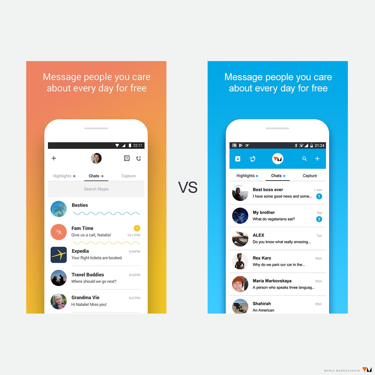
There’s Before and After below. What do you think?
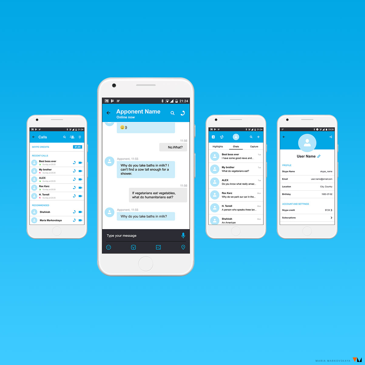
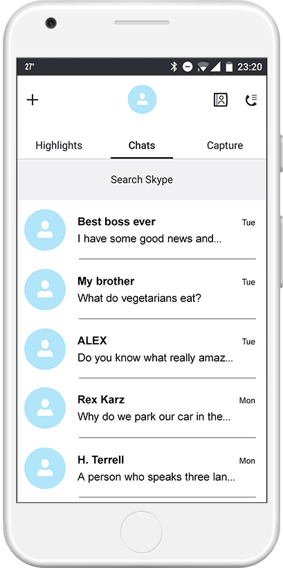
Main screen
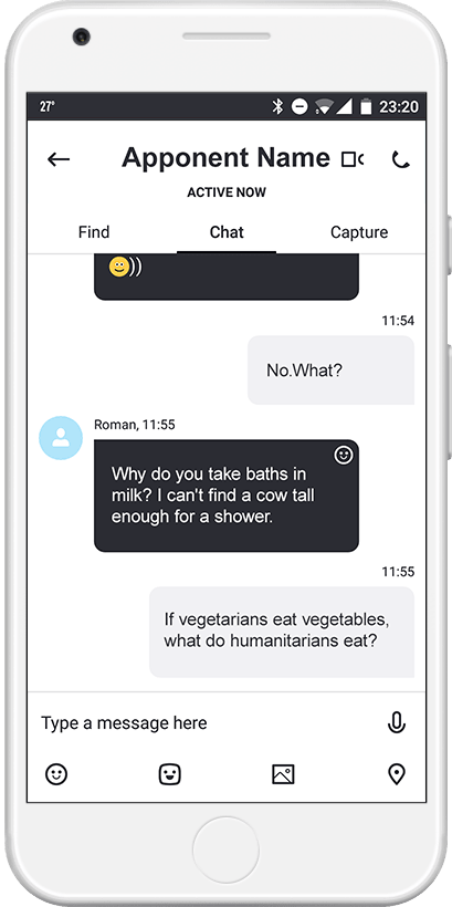
Chat screen
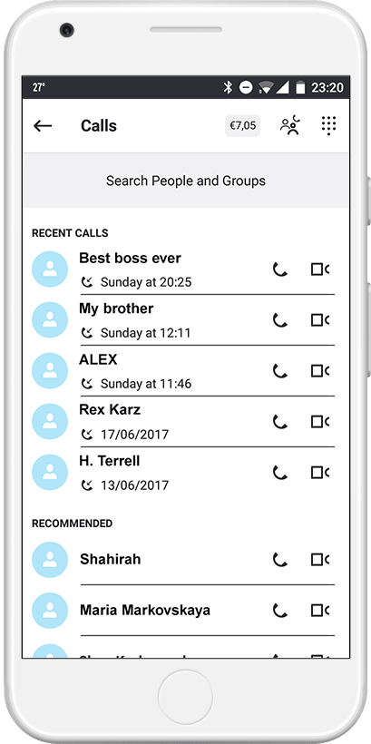
Calls Screen
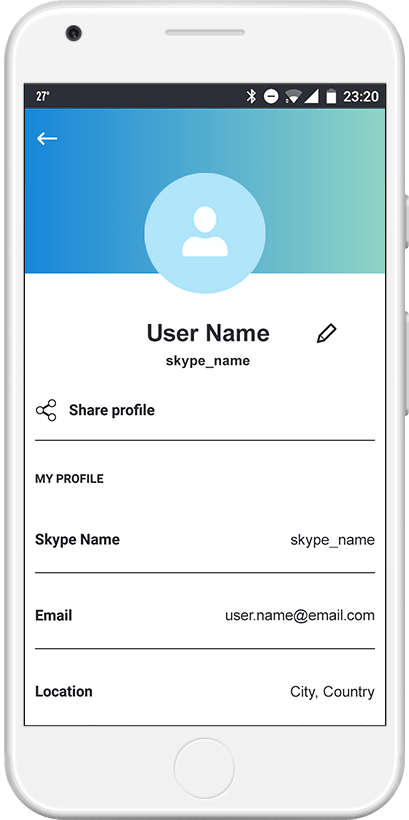
Screen Profile
